The all-important cover design. A book cover is probably one of the most challenging aspects of creating a book, which is probably why it's usually left to the end of the creative cycle, when a book has had a chance to solidify so that it can be reduced to a single visual image that can act as an effective invitation to the reader. Terry and I both got our start in art doing t-shirt design, and I think that was helpful in some ways to approaching a cover. A t-shirt is a moving piece of art and so it needs to ‘read’ very quickly, and be visually striking with a degree of simplicity, either in the message or the visual. In the case of a book cover, the art is stationary on the shelf, but the customer is moving, and so the same criteria applies. The image needs to be eye-catching and striking, and communicate something about the book very quickly.
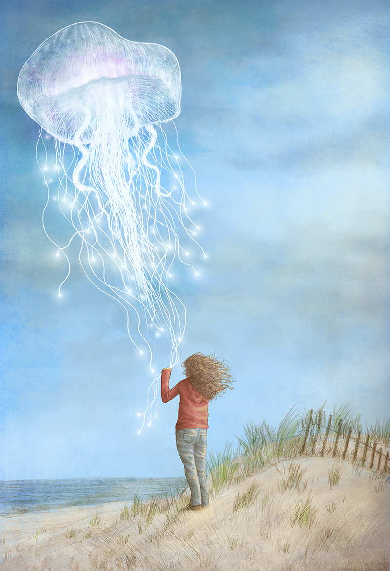
Our first foray into cover illustration was actually for a wonderful book called The Thing About Jellyfish, by Ali Benjamin (Little, Brown, Fall 2015).
This brings us to another important facet of cover design, which is collaboration. Working with the excellent designer at Little, Brown Books for Young Readers, Marcie Lawrence, along with Sasha Illingworth Maloney, and creative director David Caplan, really helped shape the final result into something successful. In our initial pass at the cover the colours were very soft and almost pastel-like:
Marcie asked us to revisit it with a bolder color scheme, and more dramatic contrast. The end result was a cover with a lot more visual punch and shelf presence.
In the case of The Night Gardener, we knew early on that we wanted an image of the topiary owl on the cover. It was one of the mood images used by our agent Kirsten Hall in her successful pitch of the book. Even so, the design went through a number of iterations until we finally arrived at something we were all happy with. Again, this was in large part thanks to Christian Trimmer and Lizzy Bromley, our wonderful editor and art director at Simon & Schuster. Our first attempt at the cover had the night gardener character himself working on the tree. This is the original rough:
It was Christian and Lizzy who pointed out that William should be on the cover instead since it was, at heart, his story. They chose a moment of quiet wonder to summarize the book, which turned out to be perfect. Even in the early rough, the elements were finally in place to proceed to the finished art:
Lizzy selected a lovely type treatment for the title. Highlighting that moment seems obvious and preordained in retrospect, but sometimes when you're close to a project, the obvious eludes you.
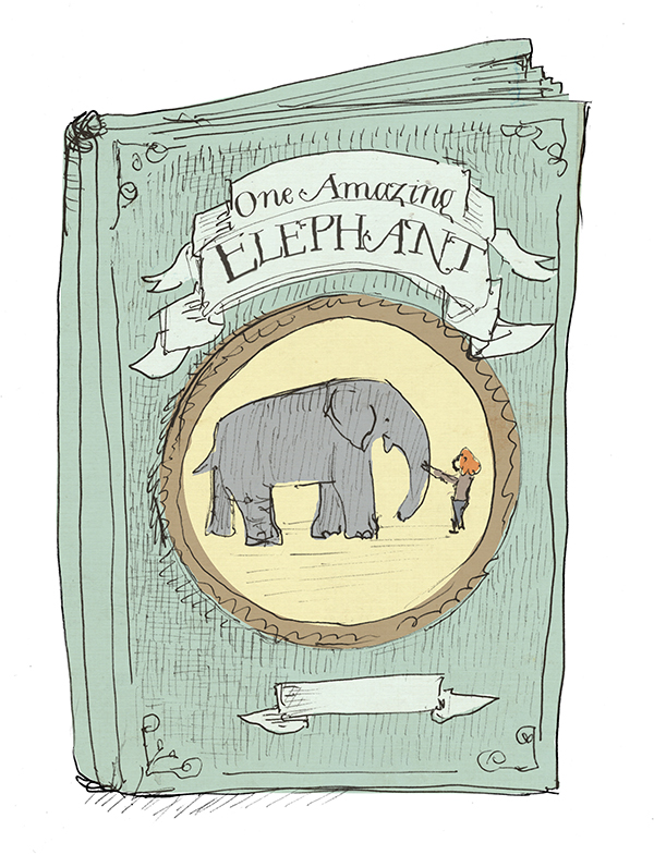
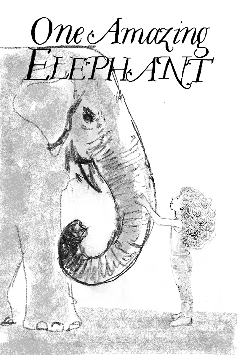
Our next cover illustration was for a book called One Amazing Elephant, by Linda Oatman High (Harper Collins, Feb 2017). Working with the designer, Erin Fitzsimmons, we presented a number of different options based on the image she requested for the cover:
With Erin's guidance, we slowly honed in on the final image and colours, which resulted in this cover:
The takeaway from all this is that collaboration is a wonderful thing. Working with passionate and creative people will often result in something stronger because the combined wisdom, experience, and insight of several people is usually more powerful than any individual's perspective (unless you happen to be a genius, in which case you can happily ignore all of this :)


